More threads by KabanaSoft

Joined
Jul 23, 2012
Messages
38
Reaction score
33
Heads up! Looks like Google has officially rolled out a new layout for Google Maps today. Our automated systems first detected the change around 2:45PM PST today (10/08/15):
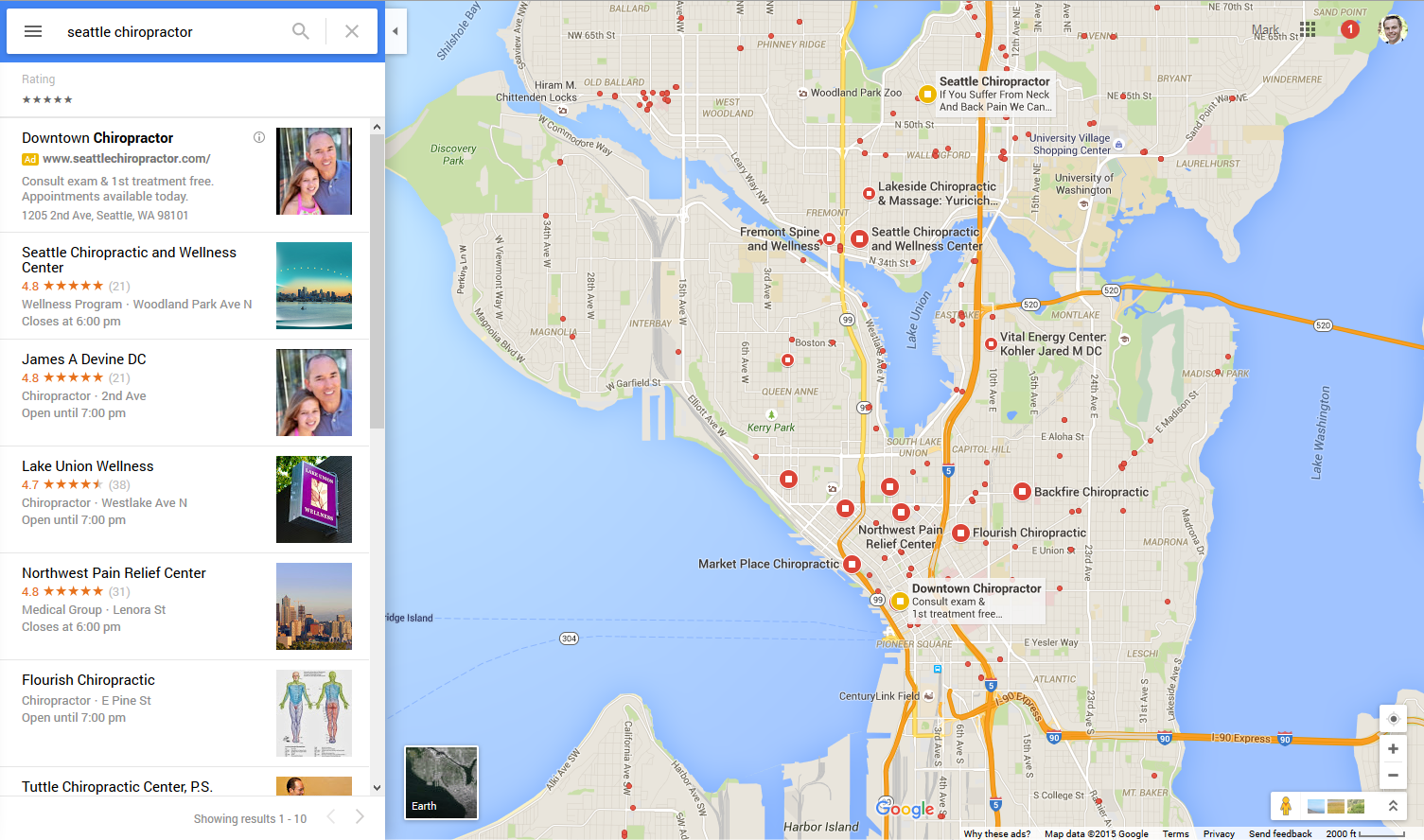
new-google-maps-layout.png


I know they have been testing this off and on for the past few weeks but i think its officially rolled out everywhere, including international servers as i have tested from many different IP addresses and am not seeing the old layout anymore.

I personally like this new layout much better than the old, seems easier to navigate and see the results without having to scroll down through that stupid dropdown results menu in the old layout. Its about time Google improved the Maps UI!!

Is anyone else still seeing the old layout?

Please share your thoughts and feedback on this new layout!
 
Hi Mark,

Thanks for sharing! I like it too!

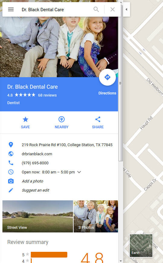
I spotted a different maps update today and was asking TCs if it was new or if it's been out awhile and I missed it. But I'm pretty sure it just rolled out.

Here's the update I spotted - new layout for individual map listings.
I love it! Very nice and clean.

NOTE: This is one more place your image could be cut off or display badly.
All the ones I checked were cut off like this. Some looked worse, depending on image.

Desktop with Firefox

NewMapsCard.jpg


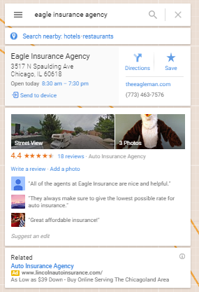
For comparison, here is the old layout (Screenshot by Joy 9/3/2015)

2557d1441285313-local-finder-photo-optimization-tips-eagle-insurance-agency-google-maps.png

2557d1441285313-local-finder-photo-optimization-tips-eagle-insurance-agency-google-maps.png


NewMapsCard.jpg
 
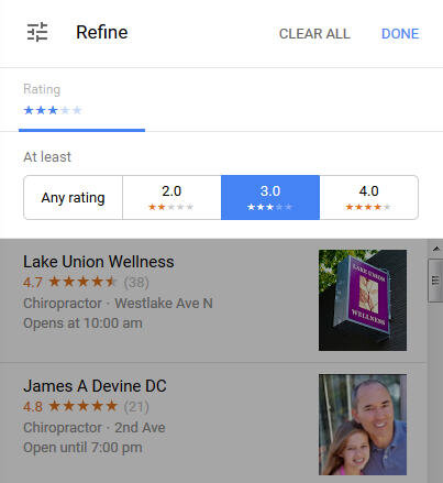
Just noticed in map search, at top of the search results, you can filter by # of stars.


NewMapsSearchFilter.jpg

NewMapsSearchFilter.jpg
 
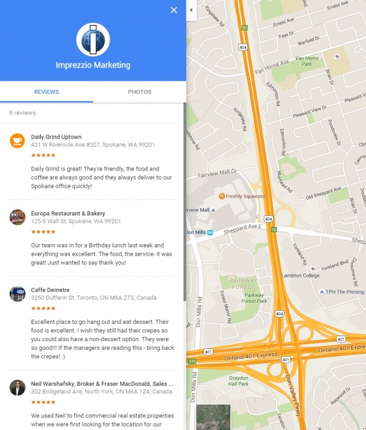
And another reason to pay attention to B2B Reviews, a totally underutilized part of most businesses review strategies.

Google Maps.jpg

Google Maps.jpg
 
Sorting by stars is really interesting! I mean, who is going to want less than a 4 star business if they look at it that way? Fascinating.

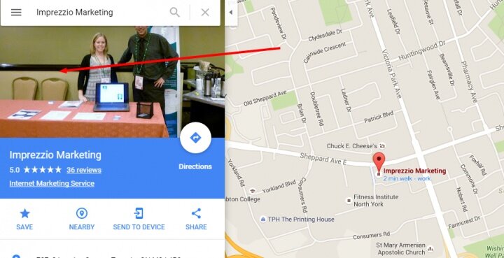
Colan - how are you getting to that view for Imprezzio? I haven't been able to replicate it on that or other businesses.
 
It use to be 1st page was winning, good enough. The NEW STANDARD: 1st page + 4 stars. Otherwise you might as well not exist. No doubt.

Sent from my SM-G900V using Tapatalk
 
Colan - how are you getting to that view for Imprezzio? I haven't been able to replicate it on that or other businesses.

Hi Miriam, I'll jump in. You never see it because like Colan said it's totally underutilized.
Most businesses have no idea they can review other businesses.

If you want to use the feature you just have to turn it on in the G+ page settings.
 
Colan - how are you getting to that view for Imprezzio? I haven't been able to replicate it on that or other businesses.

Hi Miriam, Linda is right, it's just a matter of utilizing GMB's B2B review feature.

Now, to actually get to the display that I screen grabbed, you need to take a few steps that don't seem to make any sense at all.

First you need to click on the photo.

photo 1.jpg

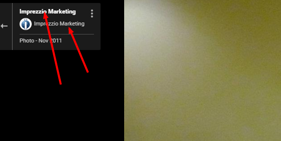
Then click on either of the links that list the business name.

photo 99.png

That's the only way I can find to get to that particular view :) Seems like it's in some kind if transitional state and Google hasn't figured out where they want to go with it yet.

photo 1.jpg


photo 99.png
 
I've been playing around with this more and more, and I like it. I see it's still difficult to get to the actual Google My Business page (which is an important point to explain to clients/your boss), but the way they're displaying all that information is a lot nicer. One less click to get a great view of the business.
 
I'm struggling with the mobile version of this. I'm trying to create a "review sheet" and a separate e-mail "review request" for a client, and the link for Google Maps takes about 4 clicks to get through to where I can write a review. Here's a similar map link: https://goo.gl/maps/KhNDbEMSzDo.

When I open up the link by itself from my iPhone e-mail client, it takes me directly to the Google Maps app. I click on the company name and can quickly scroll down to leave a review.

When I use the same URL as an embedded hyperlink behind a image of a Google icon, then it opens up Safari, and then it takes me about 4 clicks to get through to where I can leave a review.

Any thoughts on how to make it simpler for clients? Should I just put the hyperlinks underneath the icons instead of embedded them? I was trying to make it easier for the end user, but it's not working. (However, it worked fine for the other three review sites I included as options.)

FYI, either link from Chrome on my desktop yields the same results, and I can leave a review easily.
 
Hi Craig,

The whole mobile review piece has been a nightmare for a long time. Sometimes folks find a good workaround until Google changes things again. I'm sure some smart folks have some tricks that work, but I don't focus on review piece of the puzzle enough to know what they are.

Could you please copy your post and start a new thread in the Reviews section, with a descriptive title that has Google mobile reviews in it? That way some of our review experts who have answers and tips will see it and help you. Not many will see your Q buried in this Maps update thread.

Then you can come back here, or I will and drop a link to your new post for anyone that wants to have a dedicated mobile review discussion.

I'll Tweet it in the AM too and see if we can get some brainstorming going.
 

Login / Register

Already a member?   LOG IN
Not a member yet?   REGISTER

Events

LocalU Webinar

  Promoted Posts

New advertising option: A review of your product or service posted by a Sterling Sky employee. This will also be shared on the Sterling Sky & LSF Twitter accounts, our Facebook group, LinkedIn, and both newsletters. More...
Top Bottom