Linda Buquet
Member
- Joined
- Jun 28, 2012
- Messages
- 13,313
- Reaction score
- 4,148
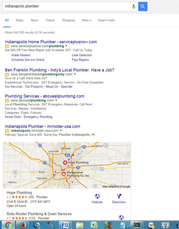
By now most of you know about the Google SERP display change that started rolling out on Friday. Essentially there are now 4 Adwords on top for competitive terms, instead of 2 or 3.
But there are no more Adwords at all on the right side.
On my browser and large screen monitor, it cuts 1 1/2 businesses out of the 3 pack,
pushing that content below the fold.
I'm still seeing the old layout on Firefox, but the new layout on Chrome, so it's easy for me to compare. In any mildly competitive local search I've conduct for plumbers, Dentists, Chiropractors, in mid to large cities, the 4 pack of ads is showing up.
So as you see above, the 3rd place in the pack is totally pushed below the fold.
How much of an impact with this have on local?
To me it almost seems like the 3 pack is now a 2 pack. Granted all along the goal should be to get clients in the top one or 2. But I'm curious how drastically hits and calls will be reduced for businesses that have held a steady #3 spot and are now below the fold?
Before if the #3 spot had more and better reviews, it could still garner a good percentage of the clicks and calls. But now pushed down below the fold???
I'm also curious what you guys think will happen to all that blank white space on the right side. One of the things it will be used for is PLA ads. But in Local, I wonder if it will eventually be occupied with a new pay-to-play Local ad unit?
Here are some posts that cover this update:
<a href="http://searchengineland.com/google-no-ads-right-side-of-desktop-search-results-242997">Confirmed: Google To Stop Showing Ads On Right Side Of Desktop Search Results Worldwide</a>
<a href="https://moz.com/blog/four-ads-on-top-the-wait-is-over">Four Ads on Top: The Wait Is Over - Moz</a>
Your thoughts on the changes???


