- Joined
- Jan 5, 2016
- Messages
- 22
- Reaction score
- 10
Good afternoon!
*edited since this appeared yesterday (or earlier)*
My apologies in advance if this has been spotted and discussed elsewhere in the community already, but I double checked and didn't see anything!
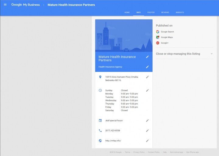
I noticed on one GMB account, but not others, that there was a streamlined look and feel for editing business info on the info tab.
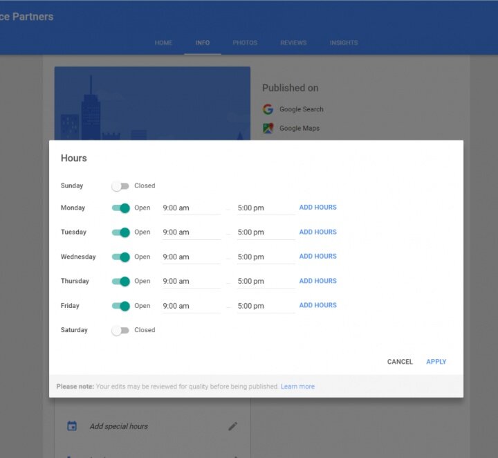
When you select the pencil for editing, a smaller pop up box still appears but also with a different look and feel:
I'd love to hear everyone's thoughts on the new UI and/or point me to more info about the change! Thanks!

*edited since this appeared yesterday (or earlier)*
My apologies in advance if this has been spotted and discussed elsewhere in the community already, but I double checked and didn't see anything!
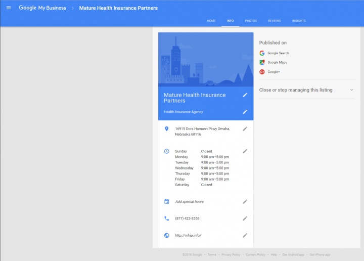
I noticed on one GMB account, but not others, that there was a streamlined look and feel for editing business info on the info tab.

When you select the pencil for editing, a smaller pop up box still appears but also with a different look and feel:

I'd love to hear everyone's thoughts on the new UI and/or point me to more info about the change! Thanks!
Last edited:


