- Joined
- Dec 12, 2013
- Messages
- 370
- Reaction score
- 106
Hi all,
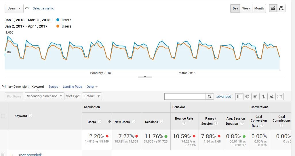
A quick question here. I have this customer, that, when I look at the graph of USERS over time, it shows that this year is ahead of last year for almost every day of the first quarter. However in the total data at the top of chart - it shows that USERS are down 2% (SESSIONS up 12%).
I think this is happening because users are visiting multiple times per month (or whatever time frame), and thus, when you total USERS for the time frame, the difference is less than what it was on a daily basis. This is the only thing I can think of that makes any sense.
Here is the chart:

is that the correct explanation?

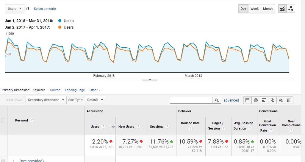
A quick question here. I have this customer, that, when I look at the graph of USERS over time, it shows that this year is ahead of last year for almost every day of the first quarter. However in the total data at the top of chart - it shows that USERS are down 2% (SESSIONS up 12%).
I think this is happening because users are visiting multiple times per month (or whatever time frame), and thus, when you total USERS for the time frame, the difference is less than what it was on a daily basis. This is the only thing I can think of that makes any sense.
Here is the chart:

is that the correct explanation?


