brettmandoes
Member
- Joined
- Nov 2, 2018
- Messages
- 101
- Reaction score
- 88
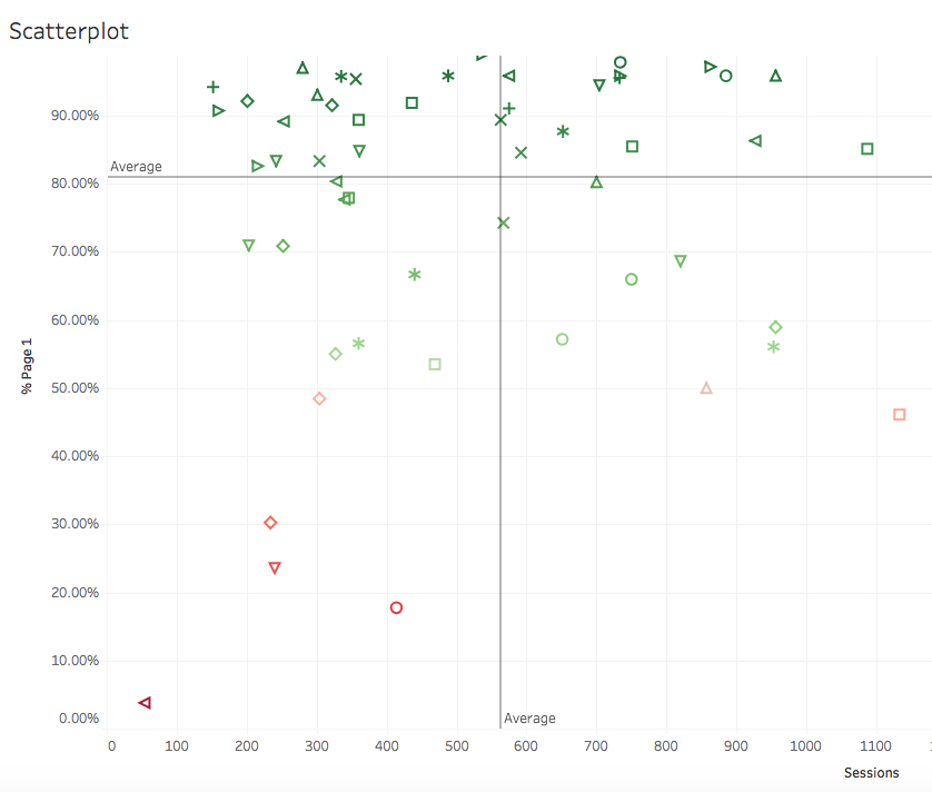
Hey guys, I've been in the Enterprise Local game for a few years now and I've worked with a number of partners to create some fun/unique resources. Thought I'd share one of my favorites with you. A few years ago, a client asked me to identify the locations that were performing below the average, but I felt that just looking at keyword rankings didn't tell the full picture. So we created this scatterplot in Tableau. Each month it's updated and shows each center's position relative to one another. The y-axis is % of keywords on page 1 (from our targeted keyword set), and the x-axis is organic sessions. What's neat is I can highlight the ones in the lower left quadrant to see who is lagging, and from there do some analysis to figure out why. It's a huge time saver, and I thought you all might enjoy. Cheers!


