LocalListings303
Member
- Joined
- Jun 10, 2022
- Messages
- 2
- Reaction score
- 0
Hold on folks, this is going to be a doozie.
We work with several hundred retail storefronts in the same industry. A new client added us to their GBPs, and we’ve noticed a number of different trends that don’t make a lot of sense to us.
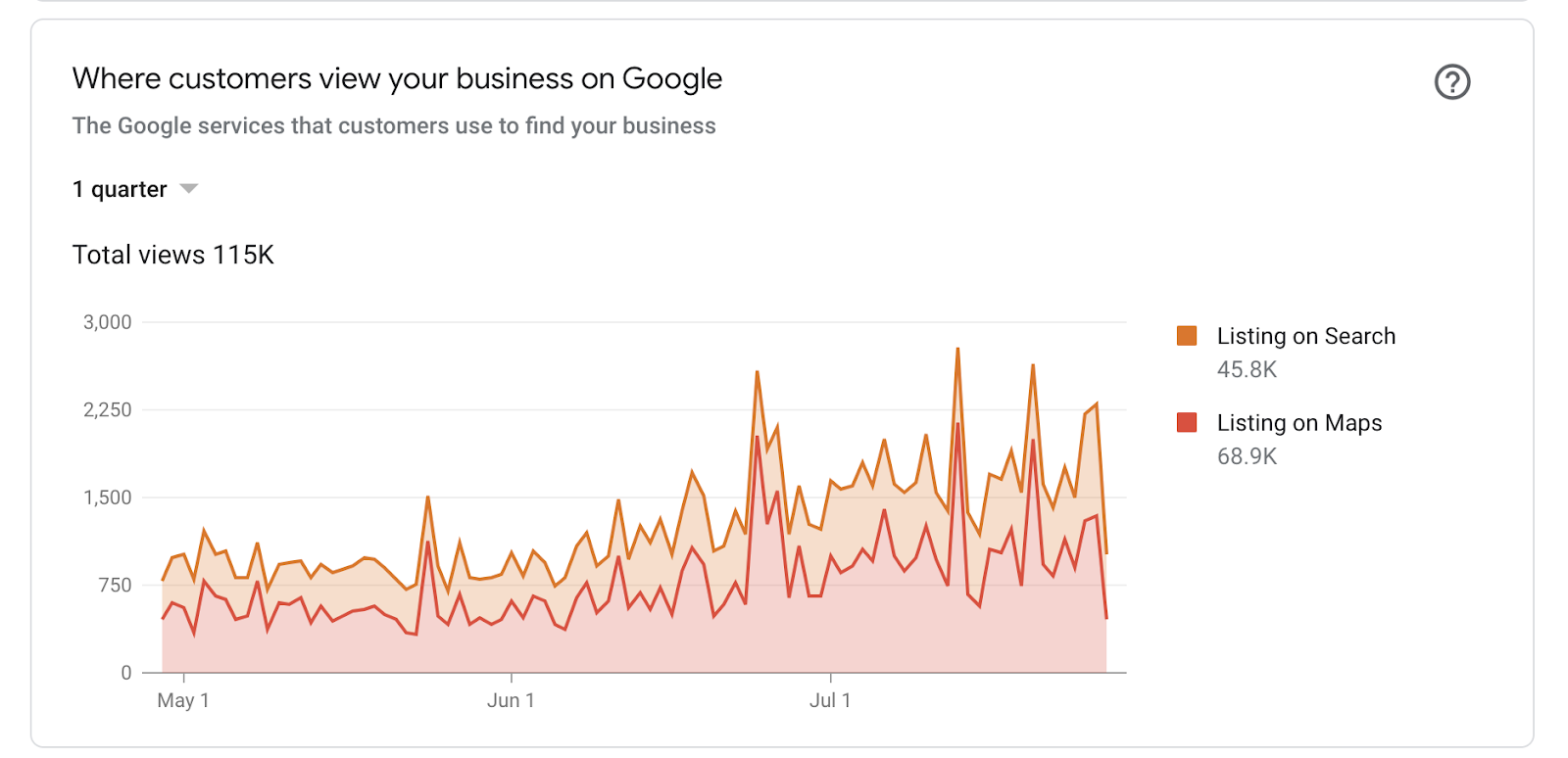
Within this industry, exposure, engagement and sales all tend to be higher on the weekends. And search exposure/engagement ebbs and flows based on myriad factors - weather, local events, holidays, etc. A typical GBP insights graph looks similar to the below graph.
However, we’re seeing something very different on the GBPs they’ve just added us to (we haven’t started working on them because we want to understand where these anomalies are coming from).
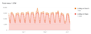
Their exposure appears to be almost standardized. Peaks and valleys in listing on maps and search that occur with startling regularity. The chart almost seems too symmetrical to match the typical fluctuations we normally see in this industry. Not only that, but the peaks are on weekdays (typically less busy) and the valleys are on weekends (typically more busy). See below. As well, these stores get a TON of direct search typically.
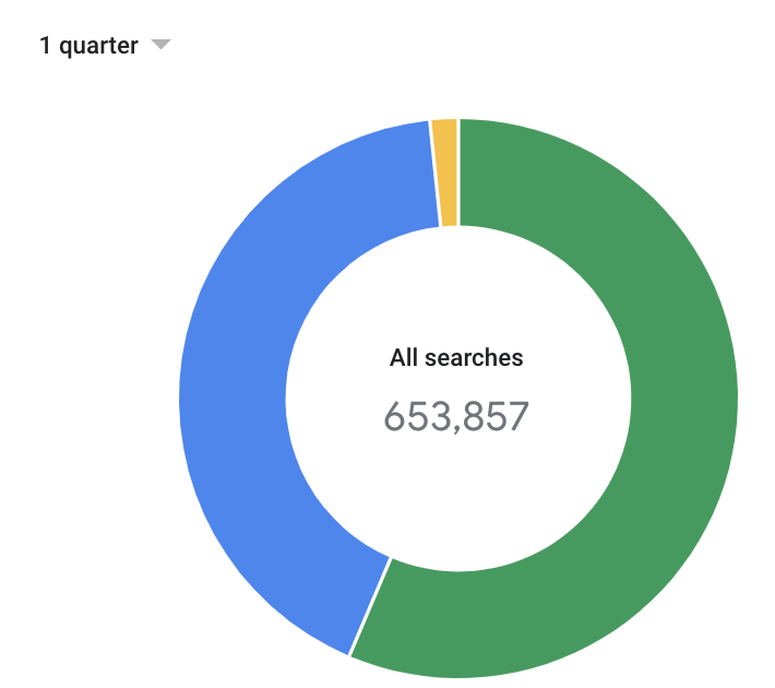
This pattern only seems to happen with large, multi-location brands in cities and markets where this particular industry is well established. This particular brand has excellent domain authority and gets a ton of organic traffic.
What’s also a little bit strange is that the fluctuations are specific to Maps. If you isolate search, the pattern disappears. See below for the same graph you see above with “listing on search” isolated.

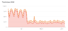
With a chart that shows a pattern like the one you see above, we’ve noticed some sharp and rather precipitous falls in exposure like what you see below, although the actions seem to stay relatively consistent (actions over the same time period).
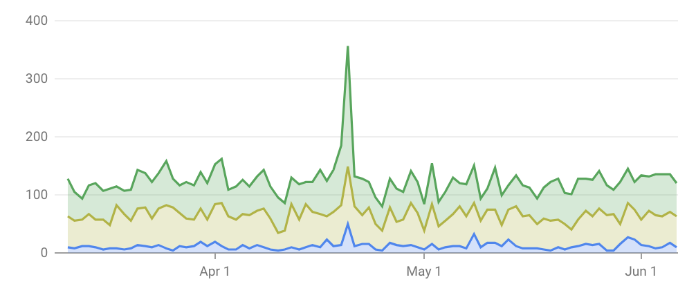
What’s even stranger is that, for a few of the locations they added us to, we’ve noticed a jump in exposure followed by a fall. The jumps display the symmetrical pattern, whereas after it falls, it looks a bit more normal. See below.
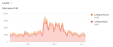
The brand previously did not have total control over all GBP pages at the corporate level - they were generally managed by the store level leadership - so we don’t really know what changes or updates might have been made to correspond with jumps or declines - but something is going on here, and without understanding what, we’re not sure how to fix it for them. We’re the first digital agency they’ve engaged with, so we don’t think that the falls are related to API integrations with tools like Yext, but we’re not entirely sure either.
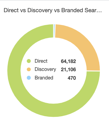
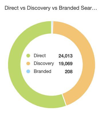
The other thing that we’ve noticed is that, when a drop off happens, it usually corresponds to a sharp drop in direct search. We know that consumer behavior won’t change overnight, so we’re theorizing that a change impacted visibility on a critical directory (Apple maps or Yelp?)
The images below show the insights graph with the drop off, as well as the thirty days just prior to the drop, and the thirty days after. It’s a huge loss of direct search.
Before (above) vs. After (below)
Like I said, this has our entire team scratching our heads and the new client will be an excellent partner, especially if we can figure out what’s happening with their digital exposure and correct it. Any insights you can give would be greatly appreciated. Thanks in advance!
We work with several hundred retail storefronts in the same industry. A new client added us to their GBPs, and we’ve noticed a number of different trends that don’t make a lot of sense to us.
Within this industry, exposure, engagement and sales all tend to be higher on the weekends. And search exposure/engagement ebbs and flows based on myriad factors - weather, local events, holidays, etc. A typical GBP insights graph looks similar to the below graph.
However, we’re seeing something very different on the GBPs they’ve just added us to (we haven’t started working on them because we want to understand where these anomalies are coming from).
Their exposure appears to be almost standardized. Peaks and valleys in listing on maps and search that occur with startling regularity. The chart almost seems too symmetrical to match the typical fluctuations we normally see in this industry. Not only that, but the peaks are on weekdays (typically less busy) and the valleys are on weekends (typically more busy). See below. As well, these stores get a TON of direct search typically.
This pattern only seems to happen with large, multi-location brands in cities and markets where this particular industry is well established. This particular brand has excellent domain authority and gets a ton of organic traffic.
What’s also a little bit strange is that the fluctuations are specific to Maps. If you isolate search, the pattern disappears. See below for the same graph you see above with “listing on search” isolated.
With a chart that shows a pattern like the one you see above, we’ve noticed some sharp and rather precipitous falls in exposure like what you see below, although the actions seem to stay relatively consistent (actions over the same time period).
What’s even stranger is that, for a few of the locations they added us to, we’ve noticed a jump in exposure followed by a fall. The jumps display the symmetrical pattern, whereas after it falls, it looks a bit more normal. See below.
The brand previously did not have total control over all GBP pages at the corporate level - they were generally managed by the store level leadership - so we don’t really know what changes or updates might have been made to correspond with jumps or declines - but something is going on here, and without understanding what, we’re not sure how to fix it for them. We’re the first digital agency they’ve engaged with, so we don’t think that the falls are related to API integrations with tools like Yext, but we’re not entirely sure either.
The other thing that we’ve noticed is that, when a drop off happens, it usually corresponds to a sharp drop in direct search. We know that consumer behavior won’t change overnight, so we’re theorizing that a change impacted visibility on a critical directory (Apple maps or Yelp?)
The images below show the insights graph with the drop off, as well as the thirty days just prior to the drop, and the thirty days after. It’s a huge loss of direct search.
Before (above) vs. After (below)
Like I said, this has our entire team scratching our heads and the new client will be an excellent partner, especially if we can figure out what’s happening with their digital exposure and correct it. Any insights you can give would be greatly appreciated. Thanks in advance!


