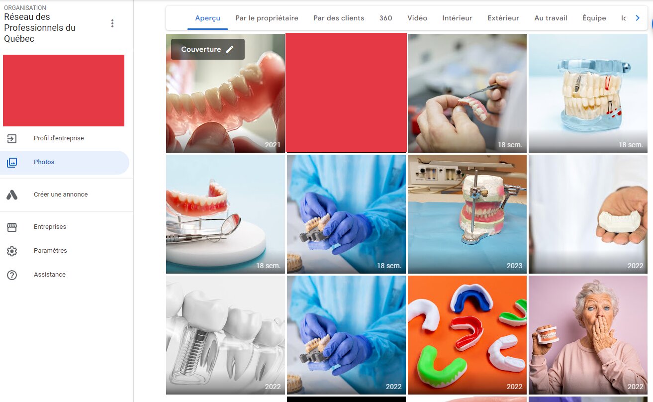
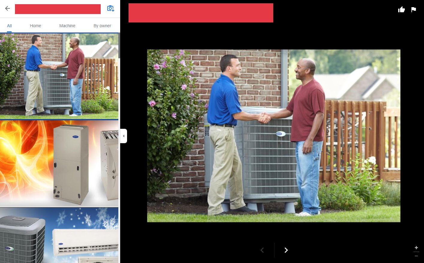
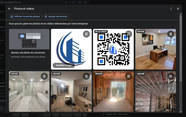
We've been noticing a new upload interface that is either in test or deployment. Ciurrently depending on the GBP and the account used to access it, we can see one of three interfaces (click for full size). the newest one is based off the new Knowledge panel photo view popup


 <<
<<
A few things of note with the newest interface:
A few things of note with the newest interface:
- The "en attente" (i.e. "waiting", "on hold" or something like that) label is new for our agency. No one had seen it before. We don,t know yet what it says in english.
- My colleague was panicking over the "rejected" labels, but despite the new "on hold" label, I'm 100% convinced this is just the same old bullshit where they show the same label for pictures waiting approval.
- We won't know for sure until 2-3 days (the normal delays for new pictures on newly validated profiles)
- There is now not an image size, but a file size requirement, which my coworker hit when trying to upload that QR code. This says "File size must be at least 9,77 Kb", which we have never seen before:
- The "upload a cover image" and "upload a logo" elements are back within the gallery
- For us, if you have the old gallery and there is no Cover image or logo defined, you cannot define these images within the gallery (only change it iif it's already defined), you have to go back to the NMX dashboard and use "add photo".
- According to my colleague, the interface for cropping the logo has also changed, but I checked it and all was okay. My coworker is not techsavy at all and so I'm trying to get in touch with the other cooworkers that got over that hurdle for more details.


