More threads by mikepcservice

Joined
Jun 6, 2018
Messages
573
Reaction score
55
I read an article from Yoast which showed "do not use dark patterns" on your site, why is this please, especially since this is the norm for Entertainment type sites. Is Yoast saying that using dark patterns would be counter productive for Google rankings?
 
I was looking for it at the time my posting but will need to look through the few articles to find that snippet, get back to you when I find it.
 
This one peaked my interest as we often use dark colors on pages and have never had an issue.

The issue is not about the color or tone itself, but the actions.
"Fix your CTAs and UX (no dark patterns)"

If you scroll down to the first comment on the article, someone else asked what they mean, and it's actually not about color. It's about the interface. Clicking one thing and being redirected elsewhere. Tricky signup forms forcing you to enroll in things. So they then link to a Wikipedia article - Dark pattern - Wikipedia

I've not heard the term "Dark Pattern" before, but it seems to be something that has been around a while - I just never knew it as that term.
 
Reason why it had sparked my interest is because when I see sites which looks clean and professional and then see a colorful site with lots of neon and I have to wonder if that is productive from an SEO standpoint? My thinking is anyone seeing all that flash and fancy colors and elements might not take the product or service seriously and bounce.
 
Color plays a part in the sales process for sure. Our old version of our website was VERY colorful. 6 main colors - green, blue, yellow, red, purple, orange - have a look on Archive.org from about 3 years ago.

During that time we used color in so many different ways from in-person (each wall in our office was a different color) and website pages/categories/CTAs, and of course we cross branded it to our YouTube videos, Facebook, etc. Now granted, we weren't doing neon or flashing lights on our site, but there was an explosion of color - very different than how our site looks today.

The reason we changed style was our story wasn't being told. We looked like an agency. We don't want to be an agency. We went from having 8 employees back to having just two of us, myself and my wife. Less babysitting :)

Can a colorful site convert? Definitely yes.

But that's all about color - the particulars of this was "dark patterns" which deals less about color and more about hidden actions that a user is forced or tricked into doing.

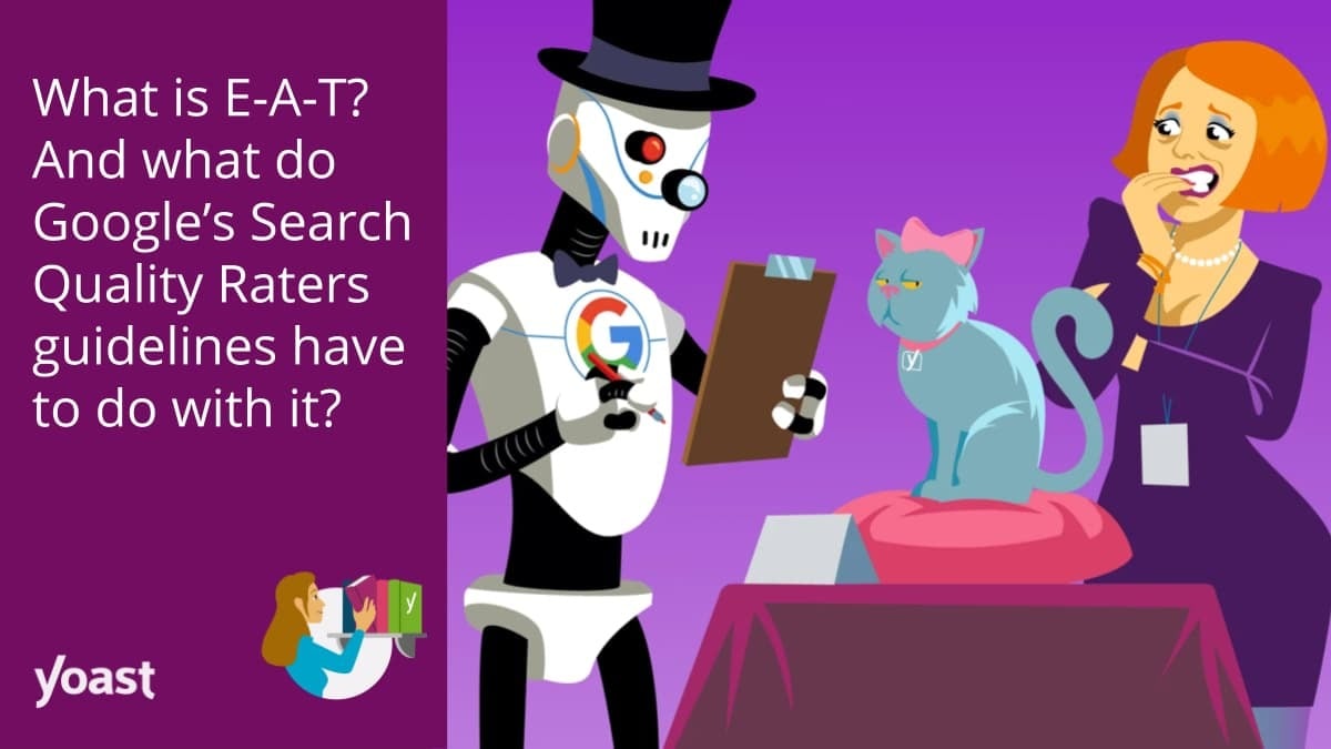
Droid-At-Big-Red-SEO-Omaha-resized.jpg
 
If you're at all curious about what kinds of tactics are considered "dark patterns", I'd recommend checking out r/darkpatterns and @darkpatterns on Twitter. Another sub, /r/assholedesign, also has a lot of examples. Stuff like putting an email list subscribe box on the screen and making the option to close the box read "no, I hate free stuff" is a dark pattern. Sadly, I've seen quite a few 'professional' SEO blogs using dark patterns, which just causes more companies to do the same thing because they think it's okay.
 

Login / Register

Already a member?   LOG IN
Not a member yet?   REGISTER

Events

LocalU Webinar

Trending: Most Viewed

  Promoted Posts

New advertising option: A review of your product or service posted by a Sterling Sky employee. This will also be shared on the Sterling Sky & LSF Twitter accounts, our Facebook group, LinkedIn, and both newsletters. More...
Top Bottom