- Joined
- Aug 13, 2012
- Messages
- 74
- Reaction score
- 8
Hey all,
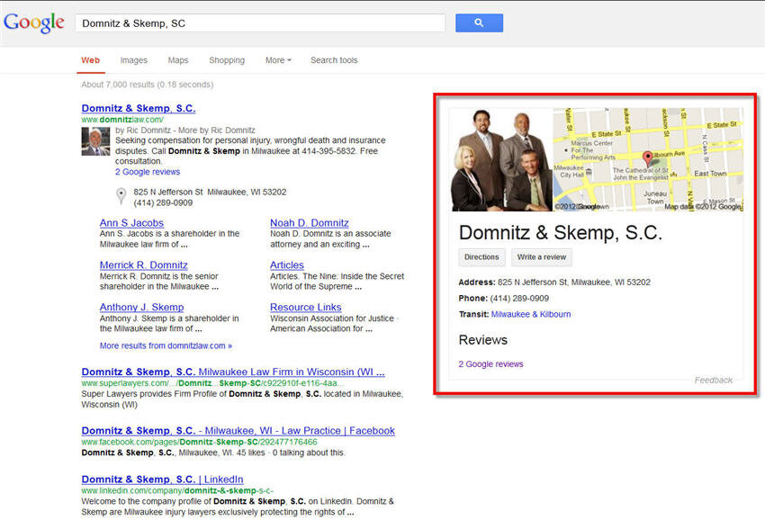
Hope everyone is having a great week so far. Just wanted to share what our team believes to be a cosmetic update to the SERP's. More specifically, pertaining to how the local listing is displayed. This was discovered by a colleague of mine, Alex Cordes. I apologize if this has already been discussed or is old news.
Please reference the image here:

Some of the more noticeable changes are:
1. Showing one image from the listing (rather than multiple images) alongside of an image of the map. (A listing with no images will simply just show the map itself.)
2. A larger display of the business name.
3. More prominent buttons that call greater attention to directions and writing a review.
What is everyone's thought on this? Hope this was beneficial.
Thanks,
Matt

Hope everyone is having a great week so far. Just wanted to share what our team believes to be a cosmetic update to the SERP's. More specifically, pertaining to how the local listing is displayed. This was discovered by a colleague of mine, Alex Cordes. I apologize if this has already been discussed or is old news.
Please reference the image here:

Some of the more noticeable changes are:
1. Showing one image from the listing (rather than multiple images) alongside of an image of the map. (A listing with no images will simply just show the map itself.)
2. A larger display of the business name.
3. More prominent buttons that call greater attention to directions and writing a review.
What is everyone's thought on this? Hope this was beneficial.
Thanks,
Matt


