More threads by Laura Duncan

Joined
Oct 11, 2016
Messages
3
Reaction score
0
Hey SEOs,

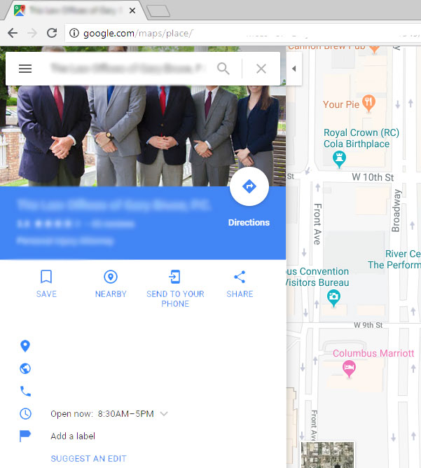
This is a design nit-pick issue but I wanted to see if anyone has a good template or suggestion for creating a GMB cover photo for a listing where the search box won't overlay the main substance of the photo. On almost every cover photo option I have used for a client, the search box in Google Maps overlays the faces of the people in the photo. It seems like a dumb UX issue on Google's part, so I am "asking the audience" for a quick fix or template I can use to avoid this issue and still have a nice, usable photo on desktop and mobile where their faces aren't always blocked. Here is a desktop screenshot example:
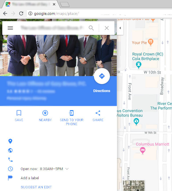
GMB-Cover-Image-Issue---LD.jpg

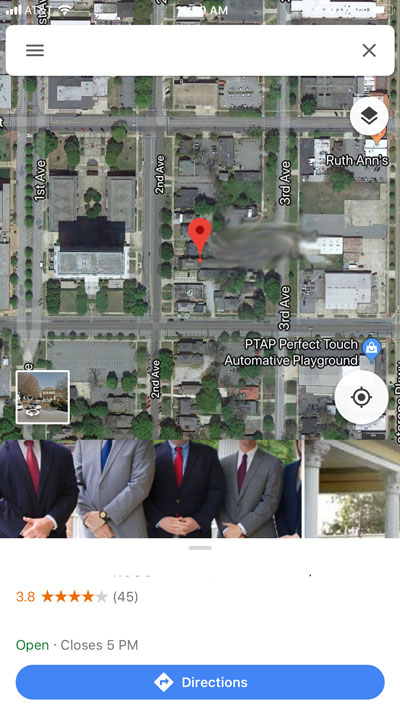
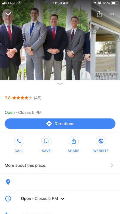
Mobile is also weird. The snippet photo that shows below the map view also cuts off their heads, but when you click on the listing to see more business information, the photo looks fine. So 2 out of 3 views have a poor UX.

GMB-Cover-Image-Issue-Mobile-1-LD.jpg GMB-Cover-Image-Issue-Mobile-2-LD.jpg

Thanks for any suggestions!

-LD

GMB-Cover-Image-Issue---LD.jpg


GMB-Cover-Image-Issue-Mobile-1-LD.jpg


GMB-Cover-Image-Issue-Mobile-2-LD.jpg
 
Hi Laura,

Yes, I see that a lot. The only thing I can think of is not to crop the pic as tight to leave more of the background above their heads. Fit it so the face/shoulder shots are within the viewing are of that top image. (I know sometimes easier said than done, since you have to work with what the client has.)
 
Hi Laura!

I refer back to this article quite a bit for these situations. Maybe it will help you... there's some great tips:

https: //localu.org/blog/your-google-my-business-profile-image-your-most-important-image/

-Cherie
 
Thank you for the input, Linda and Cherie!

Cherie, I like the article you provided, however, it was published back in 2015 and we all know how much GMB likes to update their interface... :cool: So who knows how much of that is still valid, but it's still good insight as to how varied the cover image is shown throughout various devices, platforms, browsers, etc.

Linda, you are right - I often don't crop the image I use at all, but I am left to use what I am sent from the client or photographer. We do the best with what we've got, right?

I guess I will let it go for now and just keep doing what I'm doing.

Thank you all again!

-Laura
 
Thank you for the input, Linda and Cherie!
however, it was published back in 2015 and we all know how much GMB likes to update their interface... :cool: So who knows how much of that is still valid

Normally I look for more recent whenever possible. However Mike Blumenthal is the author of this one. He'd have written a new one (or and update to this one) if there were any drastic changes, I'd wager.

Also, I work with quite a few GBL listings myself, and I've found that the 6 tips he provides are still best practice for photos in relation to Google Business Listings. Not much has changed. There's more places for photos to show, I suppose... And Google likes to pick the photo that's featured more often. I've also seen a few lately that were pulling images from the web (which used to be pretty rare, and I had two just last week).

In any case, as you said, you can only do so much with the images clients provide to you. Our design team often puts a border around photos to make them fit better for GMB, Twitter, and FB cover photo parameters. Most of the border doesn't show if done correctly. Maybe you could try something like that :)
 

Login / Register

Already a member?   LOG IN
Not a member yet?   REGISTER

Events

LocalU Webinar

  Promoted Posts

New advertising option: A review of your product or service posted by a Sterling Sky employee. This will also be shared on the Sterling Sky & LSF Twitter accounts, our Facebook group, LinkedIn, and both newsletters. More...
Top Bottom